Design Ideas
How many times do we see a hot new trend and immediately want to jump on that band wagon? When it’s a new handbag or fabulous pair of pumps, that’s one thing; but when it involves your home renovation, consider the trend very carefully. After all, the decisions we make are ones we probably have to live with for 10+ years and let’s be honest, kitchens aren’t cheap. Here are some hot kitchen trends and some things to consider before you take the plunge.
Open shelving used to be reserved for homes that were rustic in style. These days you can find them in homes that are anywhere from rustic to ultra modern. Shelves can be a great place to display decorative objects, artwork, or sentimental items. Unless you’re one who spends lots of time cleaning or has a team of folks to do so, I would think twice before storing my tableware on them. The reality is, not only do the shelves get dusty, but the items on the shelves do as well. Nobody wants a dusty cup of coffee, no matter how cute the cup is. If you love the look of open shelving, install a couple of shelves that are relatively small. That way you get the look without all the maintenance.
Waterfall countertops are all the rage and with good reason…….they are a showstopper! These will instantly add a modern feel to any kitchen and do so with quite the dramatic flair. This look can be accomplished with most countertop materials, but is most often used with quartz and marble. Stone, either natural or manmade, is an investment so be certain you love that waterfall.
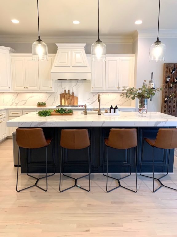
One trend I love is having the countertop continue up the backsplash. This, like the waterfall, is a high end look and will look at home in most kitchens no matter what the style. I’m often asked if this will do damage to the budget and the answer is, it depends. If you are planning on a pricey tile for your backsplash and your installer thinks that gorgeous tile is going to be more labor intensive to install, the cost may not be dramatically different. Speaking of backsplashes, I would be remiss if I didn’t mention what is admittedly my favorite trend. If you have a vent hood that has some separation from the upper cabinets, taking the backsplash to the ceiling not only adds drama (the good kind) to your space. If the ceilings are high, it draws the eye up and really emphasizes the height of the room.
Color is back, and I for one am very excited. I love a white kitchen and let’s face it, they are timeless; but……..greens, blues, grays, and shades of black are showing up in kitchens everywhere! If you love that BM Hale Navy, go for it! If in doubt, paint the island whatever color you’re in love with at the time and stick with a more neutral color on the perimeter cabinets. It’s easier and less expensive to re-paint the island in a few years. If you fancy having the upper and lower cabinets different colors, then remember to paint the upper cabinets the lighter color. The darker lowers will ground the space.
Stained cabinets are making a comeback, but with a more modern flair. Shades of light to medium brown or woods with a clear coat are everywhere. Modern, traditional, and rustic kitchens are enjoying this trend. The woods being used today have a fabulous grain due to the species or the way they have been cut. These can be installed with the grain either vertical or horizontal.
Taking the cabinets to the ceiling has been on trend for years and I hope that it NEVER goes away (Talk about a dust bunny festival)! Now we are putting single doors on the uppers going all the way to the ceiling and the look is spectacular. This really brings the eye up and makes the room appear even more spacious. It’s also a very clean look and somewhat on the modern side.
Last, but not least, the vent hood used to be a just another appliance, but now they are a statement piece. Made of wood, concrete, brass, stainless, stucco, quartz, or marble these hoods get attention. Added bonus, if you purchase that fabulous 48’-60” range and want to show it off, this is how you should do it.
These are just a few kitchen trends to think about when you’re building or remodeling your new kitchen. No matter what trend or trends you put in your home, make sure your kitchen is as functional as it is beautiful. Remember, your home should always “Welcome you home.”
Confused about window treatments? Let’s talk about the “high and wide”.
Does anyone really miss the days of ornate, heavily trimmed out window treatments? I am exhausted just thinking about it. Back then I made them all myself and quite frankly I hate to sew. We then had the “bare window” phase or the blinds/wood shades/shutters only phase. I don’t know about you, but I love a beautiful drapery panel. Whether it is a simple sheer, a soft velvet, or the texture of a beautiful linen, the way fabric adds softness makes any room feel cozy.
Thankfully window treatments are back!!! While most are simple panels, some are trimmed with a geometric, contrasting color, or fringe. But no matter what fabric or pattern you choose, some rules/strong suggestions, apply.
HANG ‘EM HIGH
At what height should you hang them you ask? Hang ‘em high! The general rule is to hang them to the ceiling, or halfway between the ceiling and the top of the window. I generally go as high as I can. You paid for those 10 foot ceilings, by all means, let’s show them off. Now, the all important length (as in where they touch the floor). They should NEVER be any shorter than 1/2 inch above the floor. Think middle school and high waters. Not a good look. Ideally they should just kiss the floor. Some puddle for a little more drama. If you have a Roomba………well, let’s just say that drama you created with “puddling” can get ugly.
HANG ‘EM WIDE
Window treatments should always be at least 6-8” beyond the window frame. The panel should just cover the outside frame of the window when they are open. This makes the window look even bigger.
FILL ‘EM UP
In order to make your panels look as full and lush as you would like, you need to make sure they are 1.5 x to 2 x the width of your window. If your fabric is light weight (a sheer for example) you might want to double the width. If your fabric is a heavy velvet or linen you might want to stick with 1.5 x the width of your window.
ROD STYLE
Now about the method of hanging……….there are a multitude of options, but let’s stick with the main five. 1) Rod Pocket-with or without the 2-3” ruffle above the rod. 2) Back Tab- hidden tabs in the back so that they slightly pleated look 3) Rings/clips-fabric is clipped to the rings. Note that this will make the panel hang 1.5”-2” longer. 4) Tabs tops-Tabs that are sewn to the top of the panel and the rod is put through. Often times people will use rope, contrasting fabric, ribbon, and whatever they have in their creative tool chest in place of the tabs. 5) Grommet- grommets come in a variety of metals and panels. These are easily found in big box stores.
LET THERE BE LIGHT……OR NOT.
And then there’s the light factor. Sheer, light filtering, all the way to blackout. Well, that decision is based on how the room will be used. For bedrooms or media rooms, blackout is a no brainer. For a family room where you want privacy and to block out that afternoon sun, panels that are lined with a lightweight fabric will work nicely. For a space that you want a little privacy, but still want the light, sheers are the way to go. One thing to keep in mind, whatever you put on your windows will be seen from the outside as well. For a more cohesive look you might want to consider using a neutral color like white or cream for your lining, blackout fabric, or sheers. Some might live in communities where the HOA requires this.
So by all means, whatever your style, start dressing those windows. Just remember, keep ‘em HIGH AND WIDE!
A few of my favorite pics for window treatments. How to mix panels and shades along with pattern and texture.
One of my favorite linen sheers
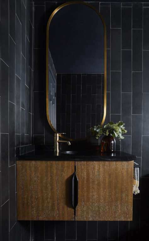
Mixing metals was taboo for many years, but thankfully the trend has changed. In the past year or so we’ve seen kitchens and baths with brass, black, chrome, copper, gold, and nickel all happily sharing the same space.
I like to equate mixing metals to putting high and low end accessories or antiques with new pieces in the same space. Just like blending these items, mixing metals makes a space feel as if it has evolved over time.
There are a few things to be mindful of when mixing metals:
Use the same finish on each metal. For example, use chrome with polished brass, nickel, or black metal with a high gloss. If you like antique brass, use it with other metals with an antique or brushed finish.
Sprinkle touches of each of the metals in the room. This will help it look intentional and balanced.
Have a “primary” metal and use the other metal/metals as you would an accent color in a room.
Keep style in mind. Whether the style of your space is vintage, traditional, or modern, make sure your hardware follows suit.
So, if you’re wanting to update your bathroom or kitchen and replacing your plumbing fixtures is not in the budget, you can still throw in that brass, nickel, rose gold, or black metal you are longing for. Simply replace that mirror with a metal frame, add a new sconce/light fixture, or replace the hardware. These can instantly update a room without breaking the bank.
Perfect example of how to mix metals (including those fabulous windows) in a kitchen.
One of the most important, and yet often times overlooked components in design is lighting. Whether it’s for a bedroom, kitchen, or outdoor patio, lighting is a key element for both aesthetics and function.
There are three different types of lighting:
- Ambient/general lighting- Yep, you guessed it, this is all about the ambiance.
- Task lighting- Think under cabinet lighting. Wouldn’t want to chop those vegies without it.
- Accent lighting- The picture light that ensures all your guests see that fabulous piece of art on your wall.
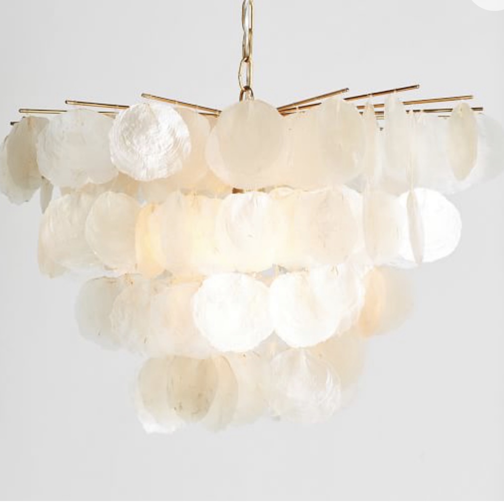
The biggest mistake I see with lighting is the use of fixtures that are too small. When it comes to lighting, size matters! That was a little crass, but you get my point. Don’t be afraid to put that big beautiful chandelier in an average size dining room or large pendants over your kitchen island. It will not make your space look smaller, but will in fact do the opposite.
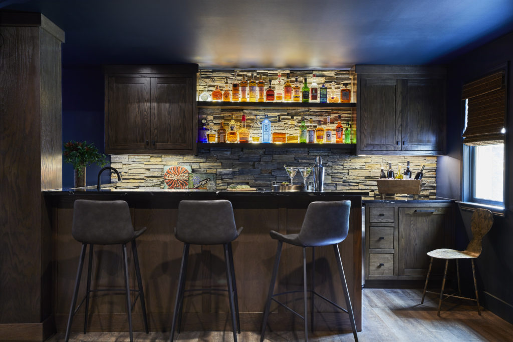
Put a dimmer on it! The reason we can put both general and ambient lighting in the same category (recessed ceiling lights, chandeliers, and fans with light kits) is due to the almighty dimmer switch. I insist that installers put a dimmer on every fixture I can. Everyone looks better in “softer light”. Your guests will love you for it. Don’t forget the lights on your outdoor spaces. Give these lights the same treatment.
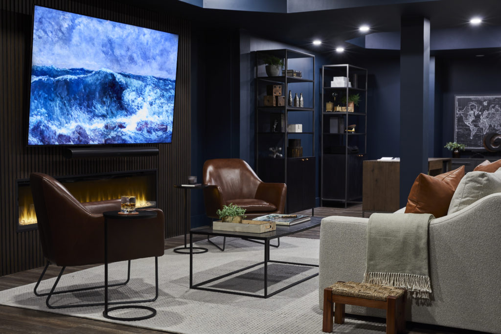
Accent lighting is perfect for shining a light on that beautiful painting or to accentuate those fabulous finds in your built ins. It can also be used to light up a dark corner, hallway, or staircase.
Just like all aspects of design, getting the lighting right takes a lot of thought and planning. Think about how you will use your space, furniture placement, where your artwork will be placed, and what you want the overall feel of the room to be. Thoughtful planning on the front end will make for a well lit room you’ll love spending time in.